Visualization with PowerBI
Choose chart type “Filled map”, and choose “country” data:

Let’s click “format your visual”:

Click “Conditional formatting”:
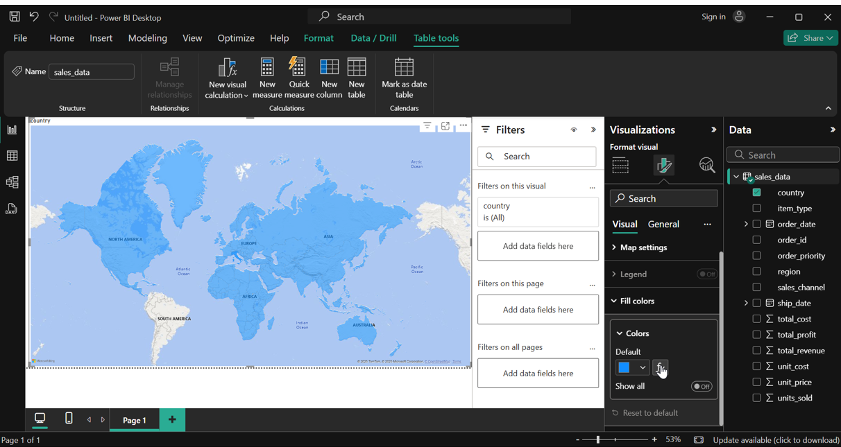
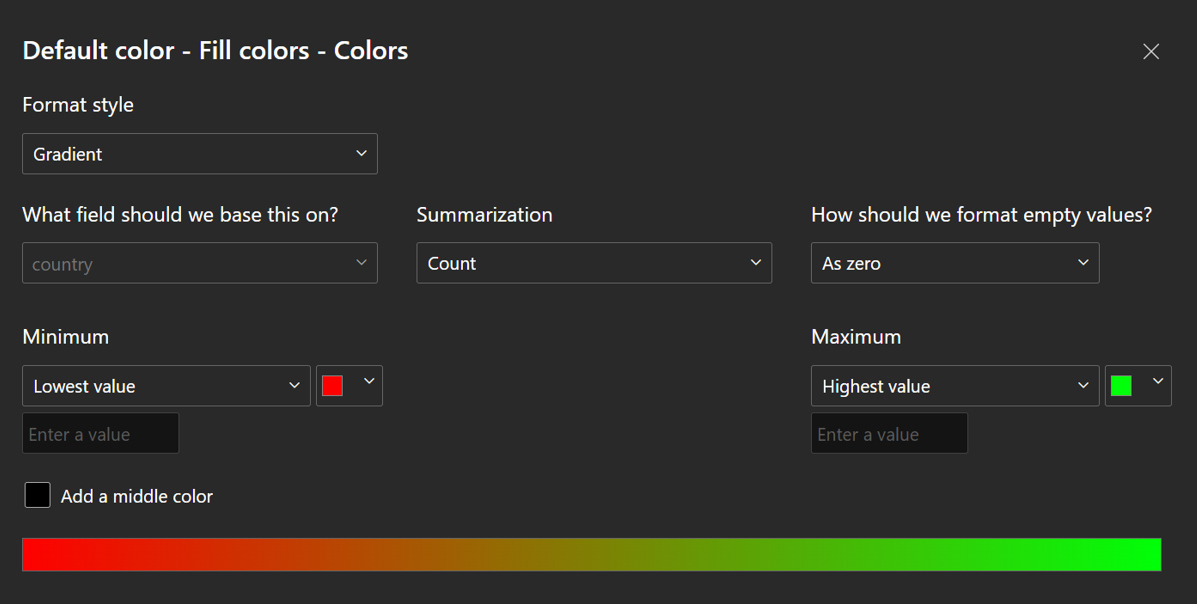
Change settings like this:
Result:

See total revenue by countries (More Green means higher revenue)

Profit by region and channels

Sum of Cost vs Profit throughout Quaters

Sum of cost throughout years in regions
